HTML5 Website
Our Services
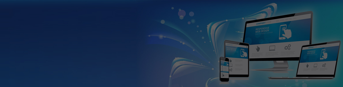
We create web pages that are easily navigable on screen of any size and device. Technically, this is called responsive web development. While designing such sites, we keep some key points in mind, namely clear readability with fluid navigation and eliminating horizontal scrolling at all cost. The sites are designed in a way that no matter which device they are accessed from, the call to action is simple and apparent to the users.
Another change which is apparent in today’s web design trends is the prevalence of touch-screen friendly components. So, we develop the most flexible features like different buttons for different screen sizes, elimination of table-forms and fluid width layouts.
The web world today is not just limited to desktop. People like to multi task and do their web browsing on mobile devices that they can carry around with them. In such a scenario it is important that your site functions just as effortlessly on mobile devices as on PCs. And the way to ensure a smooth compatibility from device to device is Responsive Web Design.
why Web Reinvent?
Responsive Web Design requires a more abstract way of thinking and our highly efficient team maintains a widening competitive advantage over other web designers. Try us out and witness a striking increase in your company’s business graph. Responsive Web Design isn’t a trend anymore, it’s a must. Digital content is meant to be viewed on an incredible plethora of devices in today’s world. Thus, Responsive Web Design offers the way forward. It’s perfect for devices that switch from portrait orientation to landscape in an instant or for when users switch from a large computer or laptop screen to an iPad.
our promise
Media queries allow the page to use different CSS style rules based on characteristics of the device the site is being displayed on, most commonly the width of the browser. Flexible images are also sized in relative units so as to prevent them from displaying outside their containing elements. Impressed already? Look out for more. We swear by the holy web to deliver you the Responsive Web Design service with a prediction for the future trends and changes.
Fluid Navigation
Smooth navigation throughout the site to make it user friendly

Zero Scrolling
No annoying horizontal scrolling for any resolution or screen size.

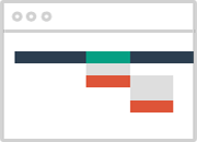
Logically Planned Layout
A layout that is based on the study of user experience
Fluid Navigation
Smooth navigation throughout the site to make it user friendly

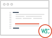
W3c Credibility
Focus on keeping elements and codes completely W3C validated

Standardized Testing
Extensive testing using standard Software Testing Life Cycle